Bank of America Redesign
A redesign of the Bank of America mobile app. A deep dive into an app that struggles and excels.


Background
The Bank of America Mobile app is highly popular on the app store, boasting millions of downloads and a 4.8-star rating from over 4 million reviews.
However, a closer look at user feedback reveals a discrepancy: the majority of real user reviews are negative. To address this, I plan to redesign the app using current design principles to enhance usability and strengthen brand identity in the competitive mobile banking market.
Problem
The main issues plaguing the Bank of America app are the following:
Lack of consistent hierarchy
Difficult-to-navigate UI
Inconsistent use of type
Cluttered menus
Unecessary Dark-Patterns
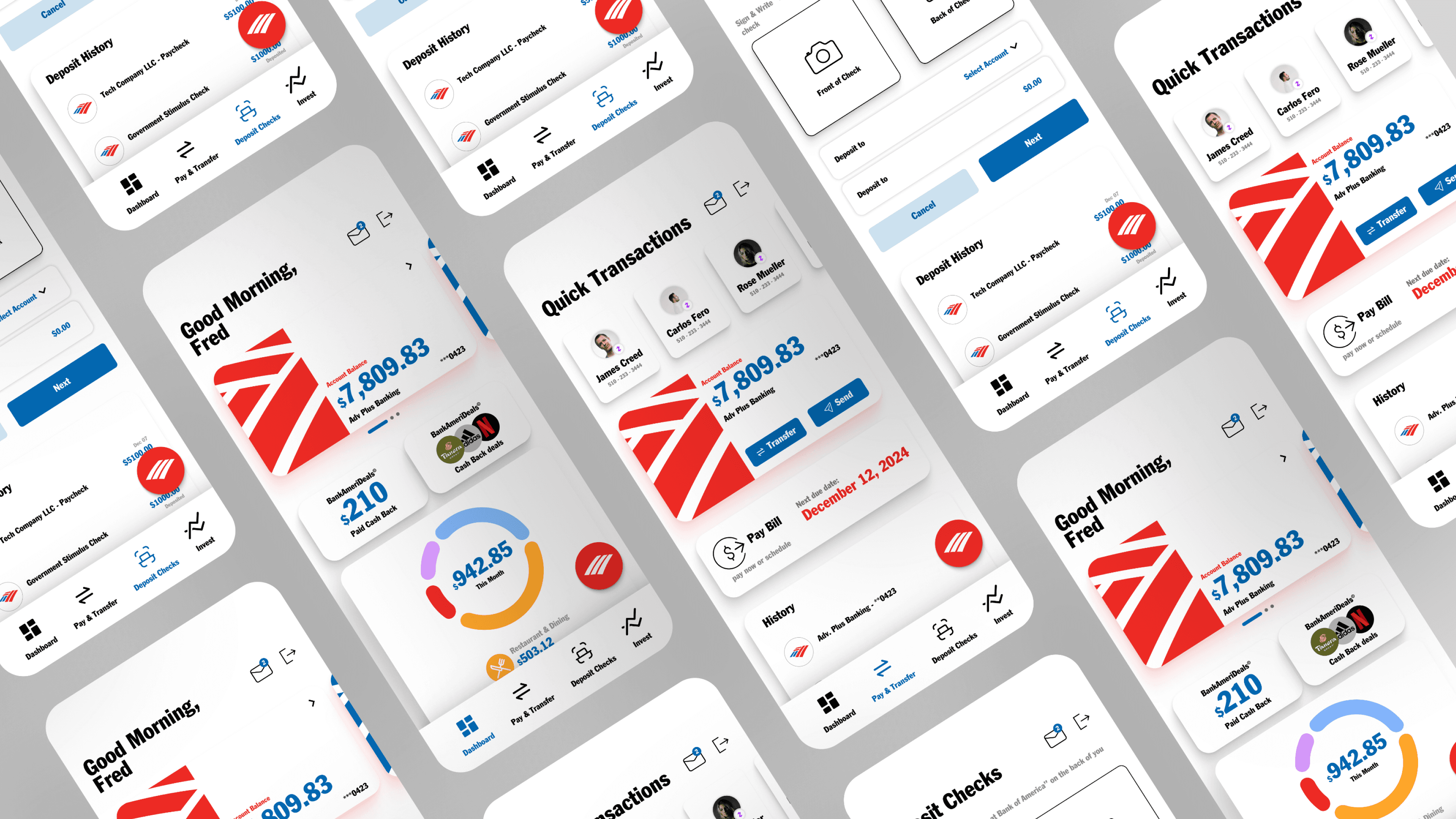
Dashboard
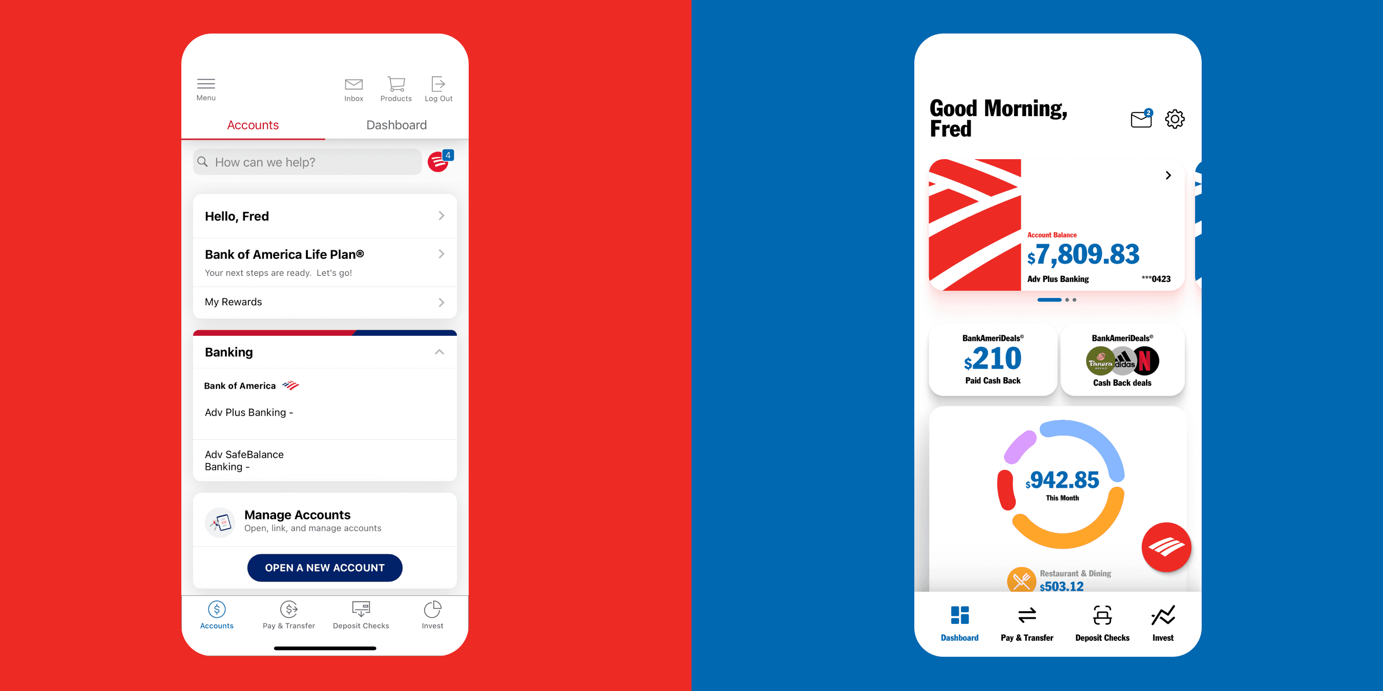
Before
One of the biggest issues with the application was the lack of hierarchy. The structure lacked the feeling of personality which is a requirement for banking. Users want to feel like they have control, especially regarding their money.
During the research process, users were found to have trouble sifting through all the initial information (i.e. greeting, life plan, rewards).
The navigation menu at the bottom simply looks outdated compared to the competition.
After
My first task was to increase the visual hierarchy of the application. The bank account balance needed to stand out. Therefore, I made the user's money the most important and obvious number on the screen.
The dashboard concept was used here because I wanted users to personalize their experience. Users could add these financial widgets, to keep track of what matters most to them.
The revamped navigation menu modernizes the icons, continuing the theme of simplicity and ease.
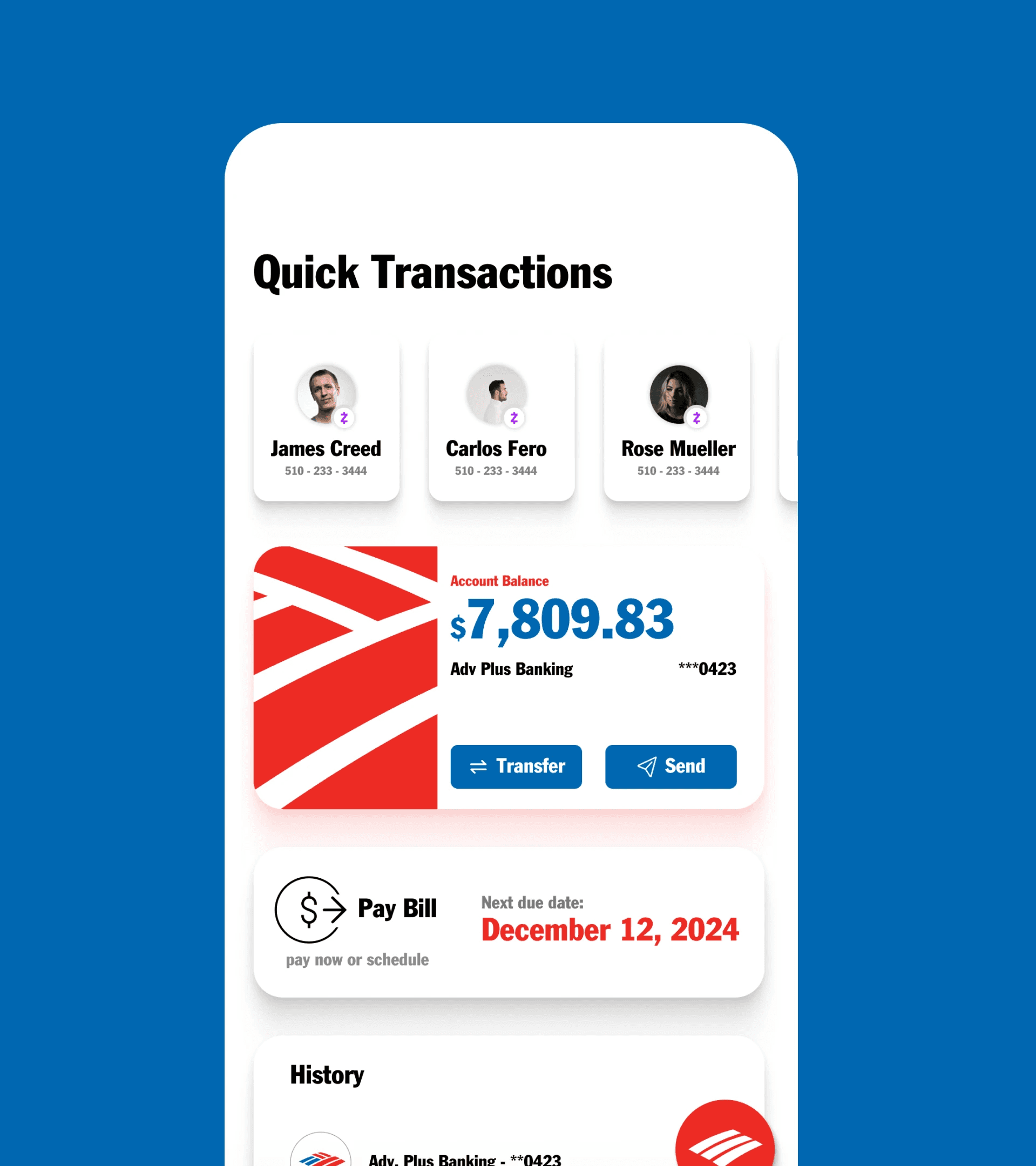
Pay & Transfer
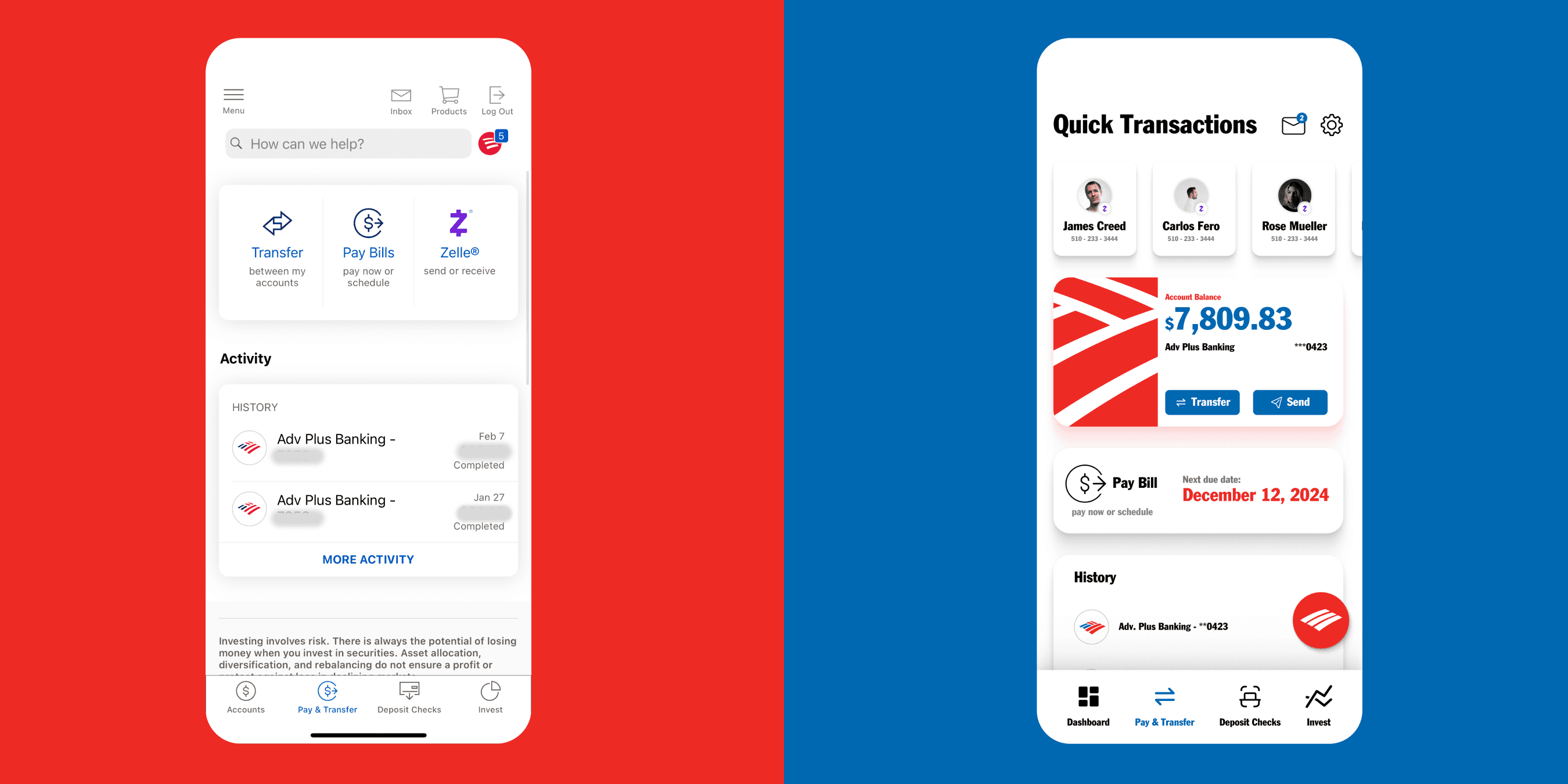
Before
The Pay & Transfer screen is used in the application to make transactions between users and accounts. Currently, the app continues to negate hierarchy.
The screen also makes quick transactions difficult. All the competitors reviewed included a form of a 'quick transaction' when users frequently transfer money to other users.
After
Here the hierarchy is continued, with an emphasis on dollar amounts. The new inclusion into the hierarchy includes the 'Pay Bill' option that is typically associated with a due date.
At the top, you can quickly make Zelle transactions with frequently interacted-with users.
Deposit Checks

Before
This screen is intended to scan and deposit checks.
The main issue with this screen is the inability to see previous or pending transactions.
The screen also suffers from a large amount of legal text that can be moved to another menu away from the user's main flow.
After
The redesigned screen makes the layout more clear and distinct, it also continues the newly proposed visual identity.
This also includes a new 'Deposit History' section. This section allows the user to review new, past, and pending check deposits.
Invest
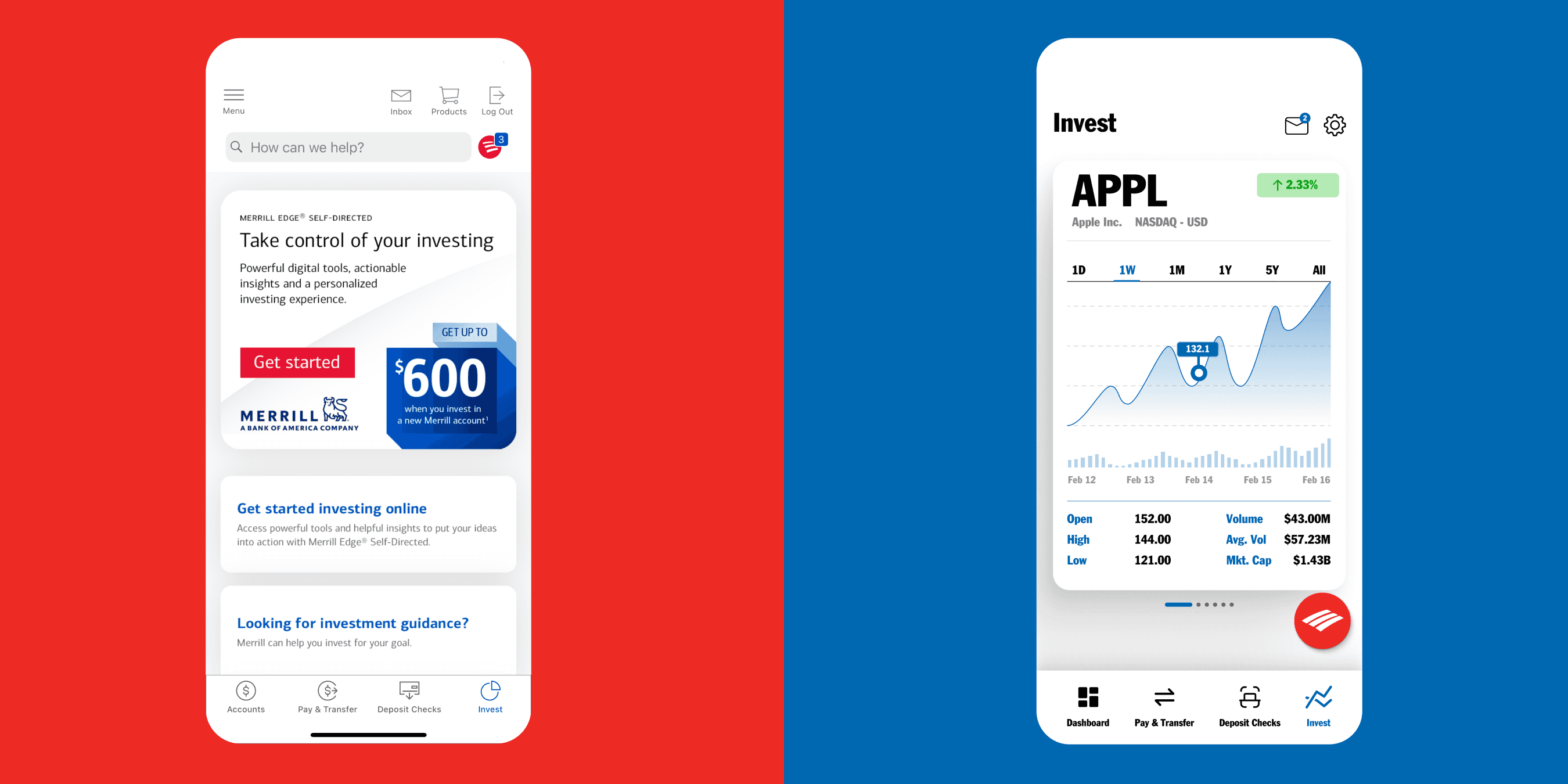
Before
The main issue with this screen is the lack of direct information about investing at all.
Instead of presenting stock information, the app chooses to focus on getting people into investing through BoA.
After
For this screen, it was important to combine existing design systems, as well as the redesigned system.
This meant continuing with the same visual style but incorporating colors and fonts to see what BoA could accomplish if they decided to incorporate a stock-like portion.
✨ Explore the full case study here! ✨